Palette 2.0
2017 Update: learn about the new rust-resistant stainless steel pans!
Over the years my travel palettes have evolved from store bought plastic palettes to modified mint tins, pencil boxes, and card holders. The Pocket Palette and all-in-one Art Toolkit idea was emerged from my 2010 High Latitudes expedition to NE Greenland, where I accompanied Danish biologist Dr. Erik Born to research walruses. Camped out on a small sandy island (indeed, named “Sand Island”), our time was oriented around monitoring walruses, who are somewhat suspicious of humans lurking nearby. In order to approach, observe, and retrieve tissue samples from the animals, we spent many hours crawling on our bellies in the sand, and I struggled to manage my sketch kit, watercolor palette, camera, and audio recorder. As a result, I was inspired to create the Pocket Palette to fit inside my sketch kit, and launched the first Art Toolkit in 2011. I’ve never stopped refining my field kit, and followed with the Art Toolkit 2.0 in 2013, an updated Pocket Palette in 2014, the compact Pocket Art Toolkit in 2015, and am now pleased to announce a much improved Pocket Palette. This new version includes three exciting changes.
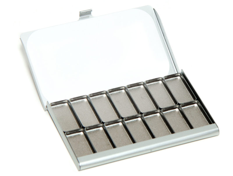
- Mixing lid sidewalls: a much requested feature, these provide both a barrier for paint and lend strength to the overall palette case.
- Uniform lower case edge: if you have one of my earlier palettes, you may have noticed the lower right and left paints were half-blocked. The problem is now solved!
- Engraving: the new palettes feature the Art Toolkit logo etched on the back.
Good news! If you have purchased a palette in the last four months or so, you already have one! If you have an older version and would like to upgrade, email me a photo of your original palette (and I’d love a story about you using it!) and I’ll send you a special code for a $10 discount.
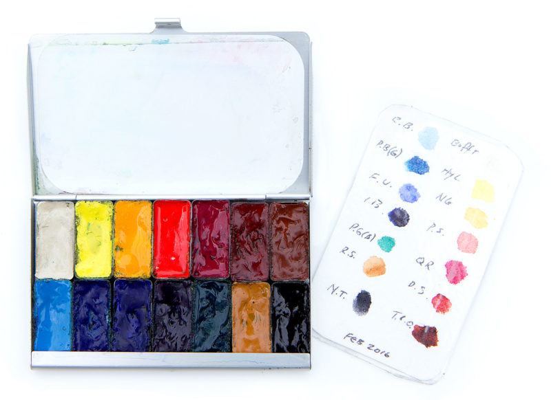
Here’s a peak what’s currently in my palette, all Daniel Smith pigments. Top row is Buff Titanium, Hansa Yellow Light, New Gamboge, Pyrrol Scarlet, Quinacridone Rose, Deep Scarlet, Transparent Red Oxide. Bottom row is Cerulean Blue, Pthalo Blue (green shade), French Ultramarine, Indanthrone Blue, Pthalo Green (blue shade) Raw Sienna, and Neutral Tint. I love playing with color and experimenting with new pigments and mixes!
18 Responses to “Palette 2.0”
Rich Polinski
I love my Pocket Art Toolkit that has the new palette and that I’ve had for about two weeks now. Because of it’s size, convenience, and having all the essentials, I’ve had time to do more sketches in the last two weeks than in the last two months. It doesn’t replace my larger kit and palette but is now an essential part of honing my skills by being able to sketch much more often and in more diverse places It’s a beautifully designed and made kit that I’m very happy with. Thank you!
Cheryl
Hi Maria,
While it hasn’t happened with the new palette (yet) I’ve had rusting issues with the old one. The rust builds along the inside edges of the pans and seeps into the paint making the paint edges dark. I’ve resorted to cleaning the pans and rubbing them down with olive oil and then adding a coat of nail polish top coat. I don’t know how long it will last. However, have you thought of spray painting the inside of the pans white for better protection against rust?
Maria
Hi Cheryl, the pans are tin-plate (instead of aluminum like the case) which makes them responsive to magnets but susceptible to minor rust. This post details how I’ve taken care of my pans. Some artist do use nail polish or spray enamel their pans which is effective, but I personally haven’t done much of myself. I have explored options for painting pans in large quantities, but it’s very expensive and I’ve never had to replace a pan.
Maria
I’ve also shared how one artist enameled their pans in this blog post, Creative Custom Pans. He did a beautiful job, but it’s labor intensive and not possible for me to do on a larger scale for Pocket Palette. I love hearing how other artists customize their own kits, though!
Julia
Hi, Maria,
What brand and color is the “ice blue” in the above image, second palette (6 square pans) to the right, the blue that is located below the orange yellow?
Maria
Hi Julia, the icy blue color is Cobalt Teal Blue by Daniel Smith. The pigment is semi-transparent with lovely granulating qualities. I love playing with different blues!
Julia
Thank you for your answer, Maria. I already have the cobalt teal blue by DS, but it looks so much lighter in your picture, just like the kind of blue I would love to have… Thank you anyway! Compliments on your website, really an inspiration!
Cathy
Hi, what colors are in your second from right palette? Do you use just this palette frequently? If I wanted to order a palette with this configuration, would that be possible?
Thanks!
Maria
Another blue I rotate in that you might love is Manganese. It’s a beautiful sky blue with fun granulation.
Maria
Hi Cathy,
I put together the palette with 8 colors as something to play with. A limited number of paints can be beneficial as you’re pushed to experiment with mixing. You can read more about my experiences with them in this blog post. I don’t offer a pre-filled palettes at this time, but you might enjoy the Daniel Smith Essentials set I have in my shop. You can supplement it with a couple of fun extras, such as a neutral brown or green.
Mary Shaw
Hi Maria, I love my pocket palette and use it often. I have an older one and am wondering if you might add a divider to the mixing area in your next iteration? Keep up the great work!
Maria
I’m so glad you are enjoying your palette. I will add your suggestion to my list!
Jason
How much does it weight without any paints?
Maria
Hi Jason, the palette weights about 2.5 ounces empty.
Gilars Zarins
How is this palette held, is there a ring on the back?
Maria
Hi Gilars, there is no ring, I typically clip the palette to my sketchbook or drawing board.
Anna Barendt
Hi,
I like this palette. Is the case still aluminum or stainless steel? I use magnets to hold my current palette to my book.
Thanks,
Anna Barendt
Maria
The current case is aluminum, with a magnet inside.