Expeditionary Art Palette
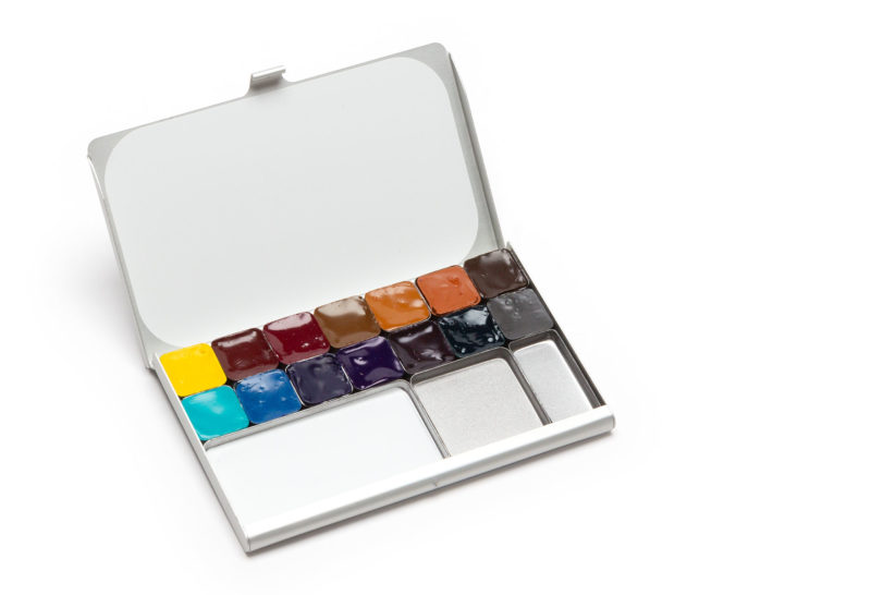
I’m happy to finally offer the Expeditionary Art Palette, filled with my favorite paints, now available in my Shop! These are the 14 colors that I most often reach for while sketching and painting, whether in the arctic or exploring around town. They are all Daniel Smith watercolors, which I’ve painted with since 1995. The paints are fantastic quality and I love that Daniel Smith is based in my home-town of Seattle.
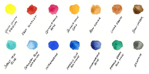
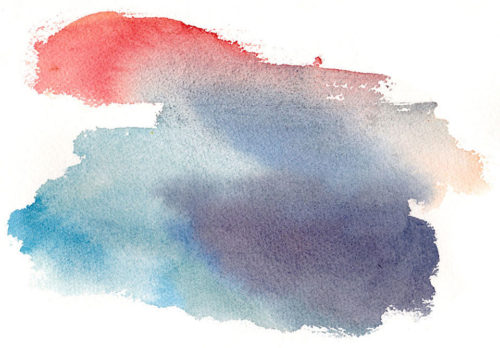
The top row of this palette features my go-to warm colors, while the lower row includes cool colors, creating countless mixing possibilities. I’ve used this palette to paint around the world, from the arctic to the pacific northwest.
As a pure primary yellow, Hansa Yellow Medium is useful for mixing with any color. Deep Scarlet is my favorite red, a rich earthy tone that works beautifully with landscapes. Transparent Quinacridone Rose creates clean purples and is useful for sunset skies.
Each neutral brown has a purpose. Transparent Quinacridone gold creates luminous greens with any of the blues and green.
Semi-transparent Raw Sienna granulates and is part of my favorite set of colors for painting subtle grey landscapes (more on that below). Lunar Earth creates fantastic textures, and I enjoy Burnt Umber for mixing with blues for varied greys.
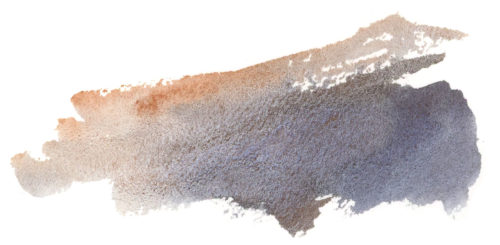
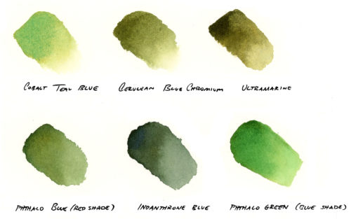
The second row of the palette includes cool colors. I love blues and managed to narrow this palette down to just five, varying from warm to cool and also varying in their opacity. Cobalt Teal Blue is a brilliant turquoise that can be washed into skies, tropical water, or highlight an iceberg’s edge. Cerulean Blue Chromium is a granulating sky blue that I often use in my paintings to create soft skies. On the warmer side, Ultramarine will mix rich purples, browns, and greys, creating textures as it dries.
Similar in hue to Ultramarine, but vastly different in properties is Phthalo Blue Red Shade. This transparent pigment is a near pure primary blue and mixes clean greens. I especially enjoy it mixed with Quinacridone Gold for foliage. Finally, Indanthrone Blue is a deep, warm, transparent blue and can create deep darks. The one green, Phthalo Green (blue shade) is a robust and transparent color, that when mixed with the red and rose creates deep greens and purples. I also love this color for painting the glow of icebergs. Finally, I’ve included a color I’ve just discovered: Graphite Gray! It dilutes into a beautiful textured grey and is opaque at high concentrations.
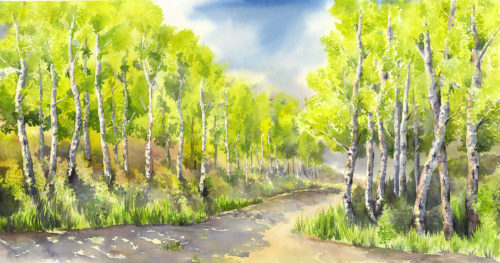
Working with a palette of just 3-5 colors can bring harmony to your paintings as your colors mixes are all related. You can read my suggestions for exploring limited palette choices, considering mood, light, and tone for your work. I also invite you to learn about my color choices for paintings such as Autumn Inspiration, Tabular Iceberg, Aspen Series, Storm Front.
Experiment, have fun, and please let me know if you have any questions!
30 Responses to “Expeditionary Art Palette”
Maryann
I love that you write in terms of which are cool and warm colors. It is very helpful when I’m trying to get this all straight. Thank you.
Maria
I’m so glad! There’s so much to explore within the world of color.
Maryann Kavanagh
Maria, How do you fill these tiny pans? A demo video would be great. I bought extra pans with my last order, but am hesitant to fill with colors that I already have. Thanks. Maryann
Maria
Hi Maryann, I’ll work on a demo video for sure, thanks for the suggestion! When I want to top of the pans completely, I fill them in two rounds. For the first one, I squeeze the paint in from a tube, smooshing it down a bit so the corners are filled in. Then comes the hard part- patience! I wait about 24 hours for the paint to dry, then top them off with more paint. Once completely full, I find they last a good long time for sketching!
Donna
Congratulations, the color palette setup is perfect for mixing and of course I just really love your palettes that you have developed. I’m enjoying my little silver Demi palette that fits perfect along with travel brush in my planner zipper compartment.
Maria
Thank you so much, Donna! I’m so glad the Demi works so well for you.
Dorothy Person
What a great blog Maria!! I ordered your palette and brushes as a birthday treat for myself and I can’t wait to get them. Thank you for sharing g these terrific color mixing ideas!!
Maria
Thank you so much, Dorothy! I hope you have fun with your new supplies!
Lisa
Hi Maria! I love learning about the colors that you use, how you arrange them in your palette and most of all seeing your paintings. I’ve never tried deep scarlet but after seeing your mixes I gotta give it a try! It’s so interesting how we all go about choosing our paints.
Maria
Thank you, Lisa! I love how we each develop our own palettes and vocabulary of color. Deep Scarlet is one of the pigments that I truly use and love in just about every sketch and painting. I hope you love the colors!
Stephanie
Hello Maria
Thank you so much for these informations. I really like your blog, it’s so nice !
I will try Daniel Smith Colors and your favorite Colors ! Espacially your limited palette :)
I really enjoyed my black pocket palette and silver Demi Palette : always in my pack !
Maria
Thank you so much, Stephanie! I’m so glad you’re enjoying your palettes!
Steph
Hi, Im really excited to order a pocket palette but very much considering this expeditioary prefilled one, which Daniel Smith Scarlet is it – ive found Pyrrol Scarlet and Perylene Scarlet when looking at the cost of replacing colours I think Ill like.
Maria
Hi Steph, both reds you’ve listed are lovely and a little brighter than my Deep Scarlet. For value, you might consider Perylene red as well. Daniel Smith sells it as part of their Triad set that also includes Hansa Yellow Medium and French Ultramarine (which I use interchangeably with Ultarmarine). Let me know if you have any other questions!
Kim Hartson
Hi!
I’m looking at upgrading my W&N cotman half pan student grade palette to Daniel Smith after trying a Daniel Smith dot card and loving them. Your expeditionary art palette looks amazing and your color choice explanations were so helpful. One question I had was how the size of your palette pans compares to W&N half pans? I’m trying to get a sense of the pricing versus creating my own palette using your pocket palette and Daniel smith tubes because I already have a few tubes of the colors in your expeditionary art palette.
Maria
Hi Kim, thank you for your kind words! My double pans hold an equivalent amount of paint to the plastic half-pans, standard hold half, and the mini pans hold a quarter of the paint. I top off my pans in multiple fills and find the paint goes a long way. Please let me know if you have any other questions!
Linda Chaplin
Hi Maria. Thank you so much for my Rosemary brush that arrived today. Now I have both the travel brushes to take on our trip to Australia. Lots of great sketching and watercoloring subjects there, for sure. I have a suggestion, Maria. I wonder if you could put together a short video demonstrating both the travel brushes. I think it might be instructive for those of us who haven’t really used either a “mop” or a dagger brush. I know I would love to see how you use both brushes in your lovely work. Thanks. Linda
Maria
I hope you enjoy your brushes, Linda, and that you have a fantastic trip to Australia! Thanks for the brush demo suggestion, I’ll keep that in mind!
Margaret Hart
Today is the perfect day to spend time with this palette and your mixing tips. It’s a thrill to make all the colors I need out of these 14 rich pigments. Thank you for sharing your knowledge and skill with me so I can feel confident taking the palette with me wherever I go.
Maria
Thank you so much, Margaret! Happy sketching, Maria
ellen meyers
I LOVE your products. Use them almost every day. My idea of a great addition would be a smallest palette with all red, orange, and yellows. Then another mini palette containing blues, green, and purples. Finally.a tiny palette with blacks, grays, browns, and buff titanium. Three tiny palettes that thoroughly cover just about all colors which is all kinds of people possibilities ! WOW!!
Maria
Hi Elle! Oh, I love your ideas. That could be a fun series of seasonal palettes… colors are endless in their possibilities!❤️
Deborah
Dear Maria,
I would just like to tell you that the identifying photos of your wonderful palettes and other products on your shop web page are missing.
Sincerely,
DLN
2/8/2021
Maria
Thank you, Deborah, you may now find all our Art Toolkit products on the new Art Toolkit website.
Casey
This is such a cool set of colors, is it still available?
Maria
We’ve discontinued the colors in our palettes, but you can fill your own! I love the set.
Kemara
What DS alternatives would you recommend for the Graphite Grey and Lunar Earth in 5 ml. tubes? I see those two only come in 15 ml. I don’t need that much even if it is more cost-effective. I’m a beginner and a 5 ml. tube will last me forever! Especially In the Pocket Palette.
Maria
I’d recommend Neutral Tint and Burnt Sienna as alternatives. Both are optional, if I had to pick one, I’d choose the Burnt Sienna! It mixes beautiful greys with warm blues.
Deb
I love my business card pallets. I have two and I have had them for a number of years. I have found that over the time I have used them a problem of rust has occurred. How do you deal with this?
Maria
Hi Deb,
Can you send some pictures to hello@arttoolkit.com? Our team can help advise you better once we see their condition. Here’s a video I made on cleaning Pocket Palettes as well. I find that coating the magnet with a touch of vegetable oil (like olive) can help condition it and protect the pans as well. I hope that helps!