Palette Choices
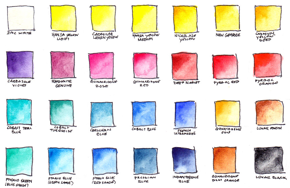
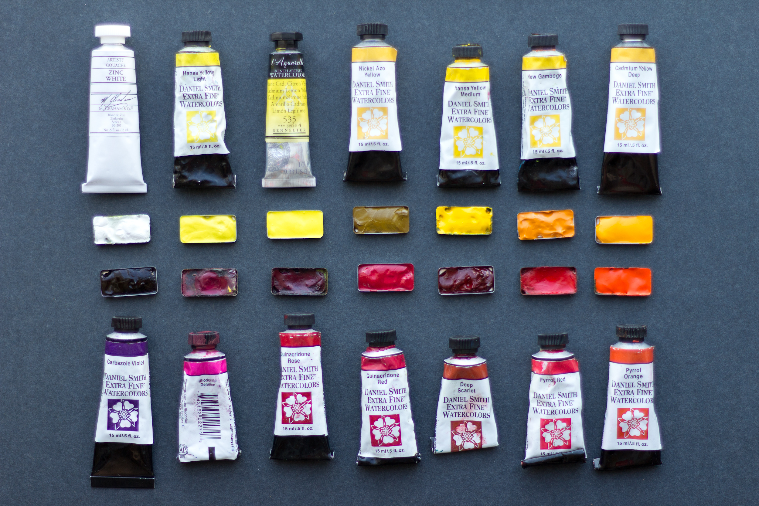
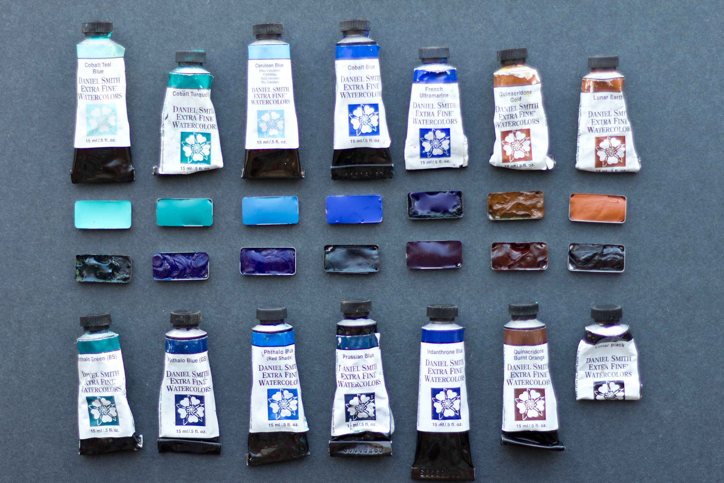
Color is a personal choice and every artist I know has their favorite pigments, brands and go-to mixes. My own palette is based on a foundation of primary colors that are mostly Daniel Smith single pigment paints (I avoid tube colors that are already mixes, such as Daniel Smith Sap Green is which is just Quinacridone Gold mixed with Pthalo Green). I choose my paints based on their variety, lightfastness, and range in their properties of staining, opacity, and granulation. I’ve particularly enjoyed Hillary Page’s Guide to Watercolor Paints as a resource and Daniel Smith’s color map for visualizing how pigments relate to each other. While working on studio paintings, I typically use a limited palette, choosing just five or so paints for the whole piece. This helps unify the painting, and also pushes me to explore what mixes are possible. In the field, though, I indulge in bringing a greater range of colors and before an expedition I spend some time planning my palette. A huge perk of my Pocket Palette is that the pans can be rearranged on the magnetic base—I often change it up!
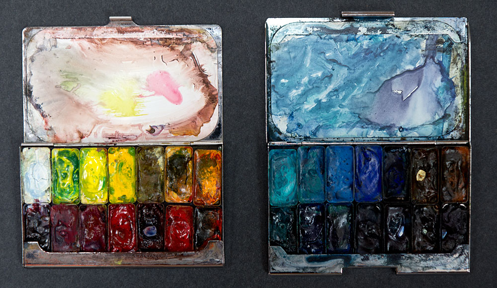
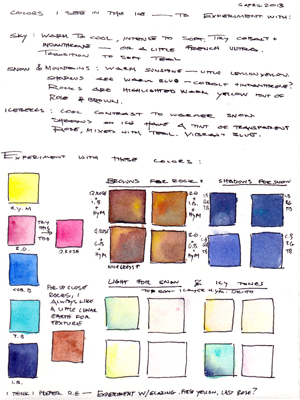
For my Greenland expedition this spring, I planned for two palettes, giving me a total of 28 pigments. I knew from my previous work in Greenland that I would encounter a brilliant atmosphere of big skies, and reflected light from snow and ice. With ice I also anticipated a range of deep blues, as well as textured rocks of muted brown and grey. Finally, I considered the colorful Greenlandic villages that punctuate the vast landscape! I compiled my favorite colors and added some extra yellows and reds I was curious to experiment with (Sennelier Lemon Yellow, and Daniel Smith Cadmium Yellow Deep, Quinacridone Red, and Pyrrol Red).
I filled my pans with paints in the Copenhagen airport hotel, the night before I flew to Greenland. I let the pigment dry overnight to a hard pan to avoid making a sticky mess of my palettes.
While in the field, I like to think about developing my “palette of place.” I sketch and paint as much as possible and also note my observations. I use my camera and audio recorder to create additional source material. Color notes are particularly invaluable and I often use them as the basis for studio paintings.
In the end, there’s just nothing like being out and about with a sketchbook! Whether you have time for to complete a full painting, a quick sketch, or just jot down some notes, the simple act of paying attention cultivates our awareness and appreciation. As my husband said in our wedding vows, “you see the world in amazing colors… ‘a pretty sunset’ becomes cadmium yellow, pyrrol orange, alizeran crimson, cerulean blue, cobalt, and indanthrone blue.” Happy painting!

4 Responses to “Palette Choices”
KerowynA
What a great post! I love your thoughts about “palettes of place” and I especially appreciate your links to the Daniel Smith color map and the “Guide to Watercolor Paints”. It never occurred to me to choose my paints with a thought to where I was going to be sketching.
We who are beginners salute you — we need all the help we can get!
Maria
Thank you! Yes, I like to expand my foundation colors with extras depending on where I’m going. For example my palette for Alaska last year had more greens (I love Windsor Newton’s Chromium Oxide). I encourage you to find your favorite fundamental colors (magenta, red, orange, yellow, cyan, blue) and see how far you can push their mixes! New colors in their fresh tubes of paint are very seductive and I try to resist bringing too many into my palette at once.
Cathy
What would you suggest as a base for a 12 color palette? Thanks!
Maria
Hi Cathy, a good value place to start with Daniel Smith is the Essential 8 set plus a few extras. http://www.danielsmith.com/Item–i-285-250-188-LIST. Some of my favorites I’d suggest supplementing that with are Indanthrone Blue, Lunar Earth, Pthalo Green, Deep Scarlet, Carbizole Violet, and Quinacridone Gold. I also like to carry Zinc White Gouache, a water-based opaque paint that can be mixed with watercolors. I use it when sketching on light tan paper, or sometimes use is it (sparingly) to add small white elements on top of dried watercolors. Good luck!