Awareness of Value
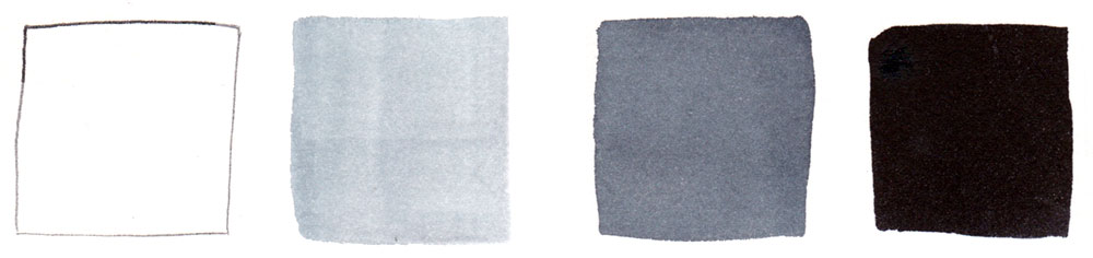
I’ve written before about how I approach a watercolor painting, and want to go into more depth about value, the relative lightness and darkness of colors. An accurate range of value helps give paintings a convincing illusion of dimension and light. To practice this, first create a monochromatic value scale from light to dark with 3-4 shades.
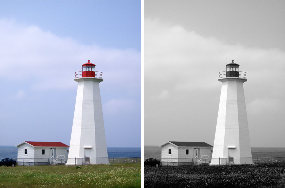
Next, select your subject and envision it as black and white. It helps to squint! If working from a photo, you can convert your image. My example below is inspired by a lighthouse from Codroy, Newfoundland, that I visited in 2006. Notice the clear range from light to dark.
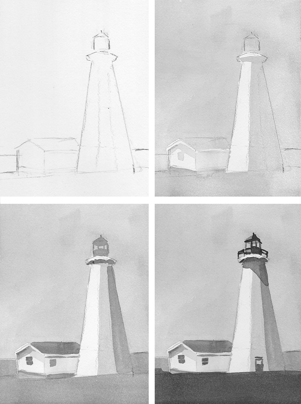
Start your value study by lightly sketching the big shapes of your composition, without worrying about detail. Next, paint all but the lightest white areas a light grey. After that dries, add medium grey to everything but your light and white areas. Allow your sketch to dry again before adding the darkest darks. Notice how the composition develops a sense of dimension!
My next post will tackle color studies with limited palettes based on this value sketch.
Leave a Reply