From the Field to the Studio
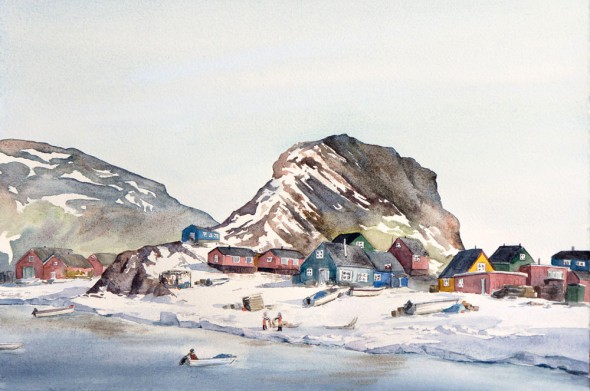
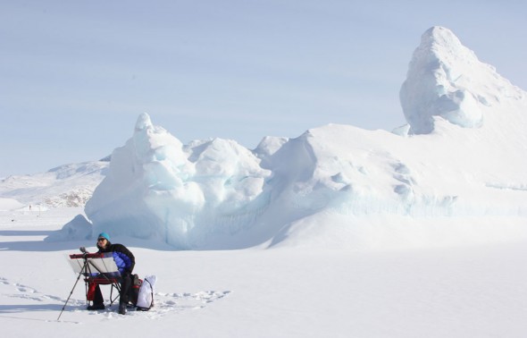
This is my my recent studio painting inspired by my spring expedition to Greenland! I love revisiting my field work and having time to create more in depth and layered pieces. My field art is the foundation for everything I do, it’s how I develop my vocabulary of color, shapes, value, mood, temperature, weather, and experiences. Due to the nature of my expeditions though, I often only have time and resources for smaller paintings, sketches, color studies, and notes. Here’s how this painting developed:
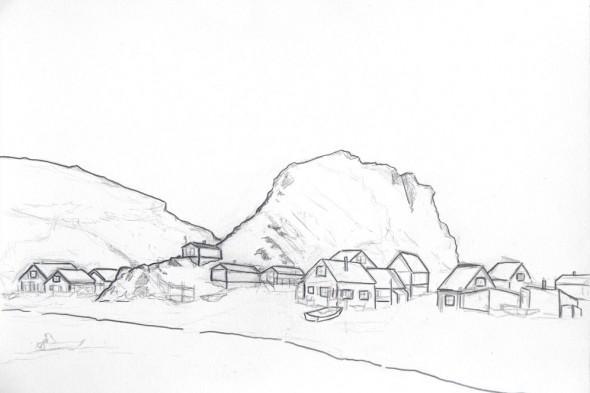
First I completed this pencil sketch on site, carefully observing the houses and shapes. I accentuated the outlines so I could trace it onto watercolor paper for painting.
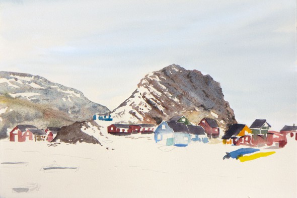
Next, still in the field, I traced the painting and created this color study on site. I used Arches Cover cream paper, which has a beautiful tone and smoother texture than the 140lb Arches cold press I typically use. It’s also softer overall, really a beautiful paper to work and travel with. I started this painting on an overcast day in March when the helicopter was grounded. As it cleared up, my Imaging the Arctic collaborator, biologist Dr. Kristin Laidre, called out to me, “we’re heading out! want to come?” I left this sketch as is, and we took off shortly thereafter to look for narwhals in the sea ice. (Read more about her narwhal research.)
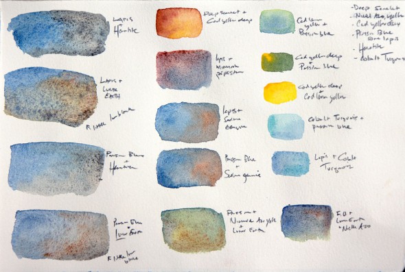
Home in my studio, I’ve revisited the field sketches and created color studies based around granulating colors and the beautiful ground mineral pigments made by Daniel Smith. Lapis Lazuli is a favorite of mine, as well as Hematite. Finally, I traced my original sketch, and painted the above painting. I’m pleased overall with the mood and intend to create a series from a number of other large sketches from Greenland, stay tuned!
8 Responses to “From the Field to the Studio”
Ann Besson
Really amazing the work you do, the life you live! I too am an artist and find your enthusiasm inspiring! Heard about you from our mutual friend Mary in Seattle…I just have to say it again: amazing!
Jewell Case
I really appreciate the careful notes you take and all the information you share so freely about your process. Do you have any insights with regard to carrying the focus and overall sensory experience of the field back to the studio? I find that sense of freedom felt from a mountain pass (or ice field in your case) is hemmed in once I get back to the everyday mundane.
Thanks!
-Jewell
Missoula, MT
Maria
Thank you for the comments! Jewell, I often use music to help recall the space, atmosphere, and freedom (or exurberance) I felt outdoors. My studio paintings typically have a very specific soundtrack, which may be an album or even a song on repeat. One band that’s closely tied to my Greenland experience is the Foals, particularly their new album, “Holy Fire.”
sandra stone demel
Your granulating color study interests me greatly. Sadly, I cannot quite make out
all the names of the pigments.
Could you please let me know the pigments center row at the bottom:
Prussian Blue is all I could decipher.
You are amazing the way you paint on
exotic locations!
Sandra, Ohio
Maria
Hi Sandra,
Sorry my notes are cryptic, I often abbreviate names, too! In the bottom row I was experimenting with Prussian Blue+Lunar Earth, Prussian Blue+Lunar Earth+Nickel Azo Yellow, and French Ultramarine+Nickel Azo Yellow+Lunar Earth. The Lunar Earth pigment does particularly lovely textures.
Maria
Kate (Cathy Johnson)
Maria, I’m sharing your post in my Art Tip this time, and sending people to check out that adorable Pocket Palette…what fun!
Maria
Thanks, Cathy! I loved seeing your studio in Sketchbook Skool, quiet wild places are so inspiring.
sandra
Life can be funny. Apparently in 2014, I asked about your Lunar Earth
trials. It is now 2023, and I just found your reply for the first time when googling myself. Indeed nice granulation. Amazing how popular granulation has become in the past decade. It certainly lends itself to depictions of nature. Hope you are still painting. S.